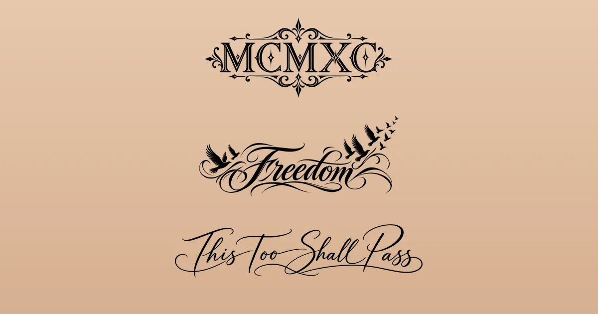
Tattoo font generator: picking lettering that still reads years from now
Will "Isabella" still read as "Isabella" once the ink has softened for a decade? A tattoo font generator lets you type a name or a phrase and scroll through scripts, blackletter and typewriter faces in seconds. Choosing the prettiest one is easy. Choosing one that stays legible at your size, on your spot, takes a few more checks, and they're all below.
Where a tattoo font generator helps, and where skin takes over
A font generator sets the text you type in dozens of fonts at once. That makes it a brilliant shortlisting tool: in a minute you can see how your exact letters behave, whether the double "l" in Isabella turns into a fence, or whether a "g" swings its tail into the next word.
What it can't show is skin. Fonts are drawn for paper and screens, where a hairline can be a fraction of a millimeter. On skin, ink lines settle and spread a little over the years, so the thinnest strokes and the smallest enclosed spaces, like the holes in "a," "e" and "o," are the first to fill in. That's why many tattoo artists redraw a font rather than inking it exactly as a generator sets it: opening the spacing, thickening hairlines and adjusting the joins to suit the placement.
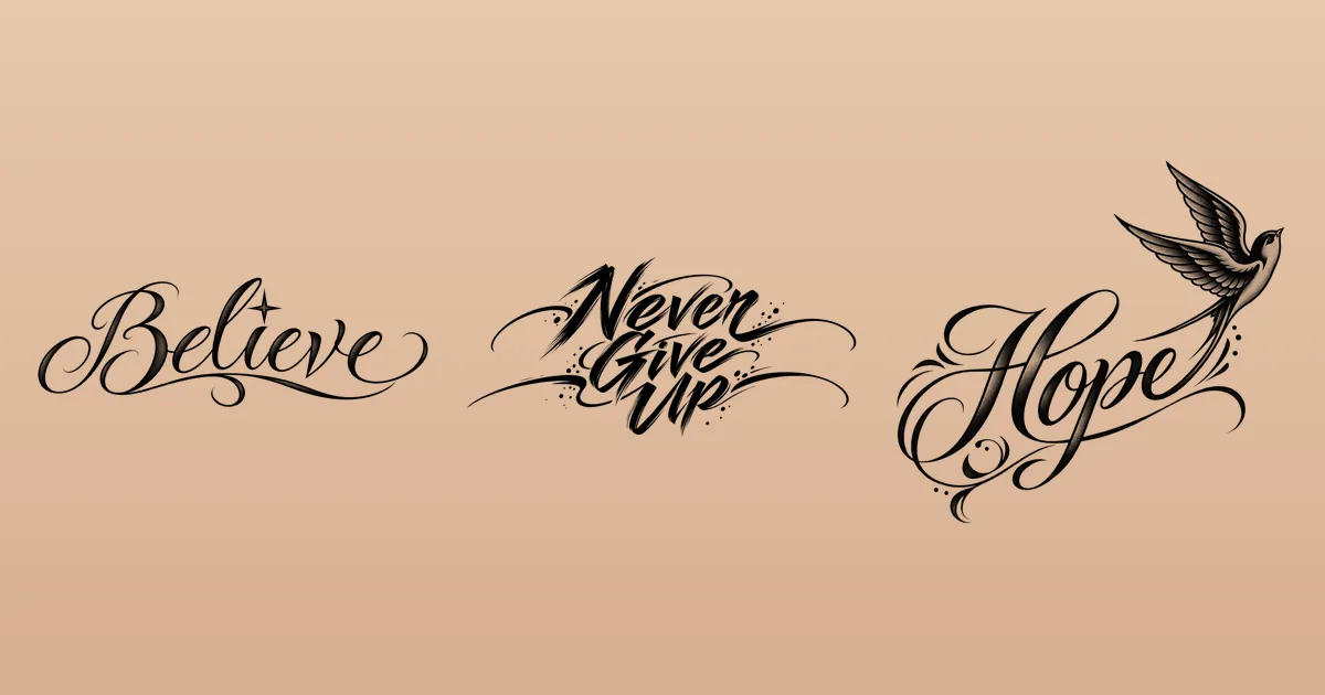
An AI design tool goes one step further and draws lettering as part of an image, like the swallow rising from "Hope" at the top of this page. Lettering and script is one of the 16 styles in the click2ink studio, and every design there is drawn from scratch for your words.
Six lettering families and how they hold up
Whatever tattoo font generator you use, most of its fonts fall into a handful of families. Each has a size and a spot where it shines:
| Family | What it looks like | Shines on | Watch for |
|---|---|---|---|
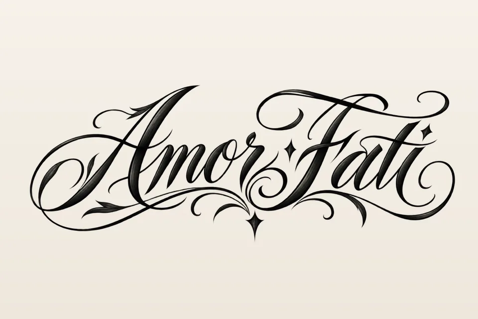
| Fine script | Thin, joined, elegant letters | Short words with room, such as the forearm or collarbone | Hairlines too thin for the size, loops that touch |
| Formal script | Strong thick-and-thin strokes, flourishes | Names and dates given space to breathe | Flourishes that crowd the word |
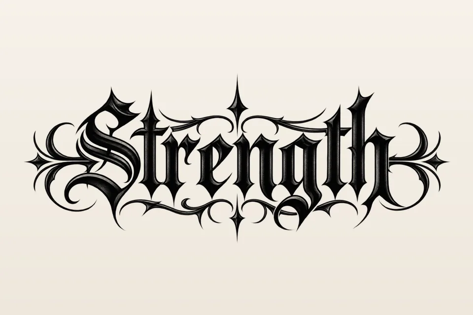
| Blackletter | Heavy, angular "Old English" letters | One bold word on the chest, stomach or forearm | Capitals that are hard to read, too little height |
| Brush lettering | Energetic strokes with movement | Short phrases with attitude | Dry-brush texture too fine for skin |
| Typewriter and serif | Even, plain letters with small feet | Quotes, coordinates, a single word | Very thin serifs at small sizes |
| Clean sans-serif | Simple, even strokes | Tiny words, initials, dates | Letters set too tightly |
Scripts themselves come in two moods. As the entry on script typefaces explains, formal scripts follow the regular hand of old writing masters, while casual scripts look looser and brush-made, and not every script joins its letters. Blackletter began as a medieval book hand and is still popularly called Gothic or Old English; its dense, angular strokes reward a bit more height than you'd think.
Size, spacing and the squint test
A good font at the wrong size is still a bad tattoo. Before you commit, run these checks on your shortlist:
- See it at the real size. Print it as large as it will be on the body, not as it looks on your phone.
- Squint at arm's length. If the letters blur into one shape now, they will on skin later. Go bigger, shorter or more open.
- Check the holes and gaps. The insides of "a," "e," "g" and "o" and the spaces between letters need room. Tight spacing is the first thing to go.
- Match words to the space. One word suits a wrist; a long line wants the forearm, the ribs, the spine or across the upper back.
- Ask your artist for a minimum. They know the smallest size at which they'd letter your phrase in that style.
The click2ink figure shows every tattoo at its real size in centimeters, sized to your height, and the print page adds a 5 cm check ruler so you can confirm the paper matches; the features page shows both. For general sizing, see our tattoo size guide.
Which way should the words face?
Text has a reader, and you get to choose who it is. On the inner forearm, words can face you, so you read them when you look down, or face the people across from you. Along the ribs or the spine, text runs vertically; decide whether it reads from the top down or the bottom up. On the collarbone or chest, remember that you'll mostly see it in a mirror, reversed, while everyone else reads it the right way round.
Hands and fingers are hard places for fine lettering, so ask your artist before you plan a name across the knuckles. On the 3D figure, turn the body and switch to arms out to see the inner arms and sides from the angles people will actually see them.
Spelling, translation and font licenses
A lettering tattoo has one job: to say exactly what you meant. Three checks protect it:
- Spelling. A tattoo font generator sets exactly what you type, typos included. Read it letter by letter, then have someone else read it back to you. Check names with their owners (Isabella or Isabela?) and dates in the order you mean them, since 04/07 is April in one country and July in another.
- Translation. Never trust a translation app for a language you can't read. Ask a native speaker, ideally two. Right-to-left scripts such as Hebrew and Arabic also need the correct direction, and Arabic letters change shape depending on where they fall in a word, which simple font tools can break.
- Licenses. A font labeled "free" may be free for personal use only, so read its license. Fonts under the SIL Open Font License can be used in artwork with no credit needed, according to the license's own site.
AI drawing tools can misspell, too, so treat every letter of an AI design as unchecked until you've read it. In click2ink, the editor's text tool adds an exact name or date by hand at no credit, which takes the guesswork out of short text. For ideas on what to write, see our guides to name tattoo designs and meaningful tattoos.
Once the lettering is right, our guide to the tattoo stencil maker covers turning it into clean linework for your artist.
Lettering questions, from readability to other alphabets
What is the most readable tattoo font?
There's no single winner, but readable tattoo lettering shares a few traits: open letter shapes, strokes that aren't too thin, and generous spacing. At small sizes, clean sans-serif or typewriter styles usually read best. Scripts and blackletter can be just as legible when they're given enough height. Always judge a font at the size it will be on your body.
Can I use any font for a tattoo?
Check the license first. Some fonts labeled "free" are free for personal use only, while fonts under the SIL Open Font License can be used in artwork with no credit needed. In practice, your artist will usually redraw the lettering by hand, adapting it to your skin and placement, so the font is more of a starting point than a file they copy.
Why do small script tattoos blur?
Because ink lines settle and spread a little in the skin over the years, and script packs its detail into the thinnest strokes and the smallest loops. When those close up, letters start to merge. More height, more open spacing or a script with fewer hairlines all help, and your artist can tell you how far to go for your spot.
What's the difference between cursive and script?
Cursive is joined-up handwriting, where each letter flows into the next. Script is the wider family of lettering based on handwritten strokes: formal scripts with regular, elegant joins, and casual scripts that look looser and brush-made. Not every script joins its letters, so if you want a continuous flowing line, say so in your description.
Should lettering be in capitals or lowercase?
It depends on the family. Flowing scripts usually read best in lowercase with a single capital, because script capitals are ornate and hard to read in a row. Clean sans-serif and serif letters work well in all capitals, especially for short words, initials and dates. Blackletter is the hardest to read in all capitals, so keep it to one capital at the start.
What font is called Old English in tattoos?
That's blackletter, a family that began as a medieval book hand and is also called Gothic. It's bold and dramatic, which suits a single strong word or a name across the chest or stomach. Give it enough height: its dense, angular strokes need open space inside each letter to stay readable as the tattoo ages.
Can AI draw lettering without spelling mistakes?
Not reliably. Image models sometimes swap, double or invent letters, especially in long phrases. Read every letter of an AI design before you print it. For an exact name or date, a safer route is to let the AI draw the artwork and add the text by hand in the editor, which in click2ink costs no credit.
Can a tattoo font generator handle other alphabets?
Only if its fonts include those characters. Many decorative fonts cover just the basic Latin letters, so accents, Hebrew, Arabic or Cyrillic may fall back to a plain font or show up as empty boxes. Check every character in the preview, make sure right-to-left text runs the right way, and have a native reader confirm the result before it goes anywhere near a stencil.
Can I mix two fonts in one tattoo?
Yes, and it's a classic move: a flowing script name above a small serif date, or one bold blackletter word with a delicate line beneath it. Keep it to two families, make them clearly different rather than nearly alike, and check that the smaller one still reads at its real size. Your artist will balance the weights so neither overpowers the other.